
PowerPoint Presentation Design
The key to a successful presentation is to make certain your slideshow is a visual aid and not a visual distraction.
How many times have you sat through poorly designed PowerPoint presentations that were boring, cluttered, and distracting? Probably way too many. Even though we all loathe a boring presentation, when it comes time to make our own, do we really do any better?
The good news is GKVD Consulting has the professional designer to know how to make an awesome and attractive presentation.
There are a few rules and tips to follow for creating a professional, beautiful presentation:

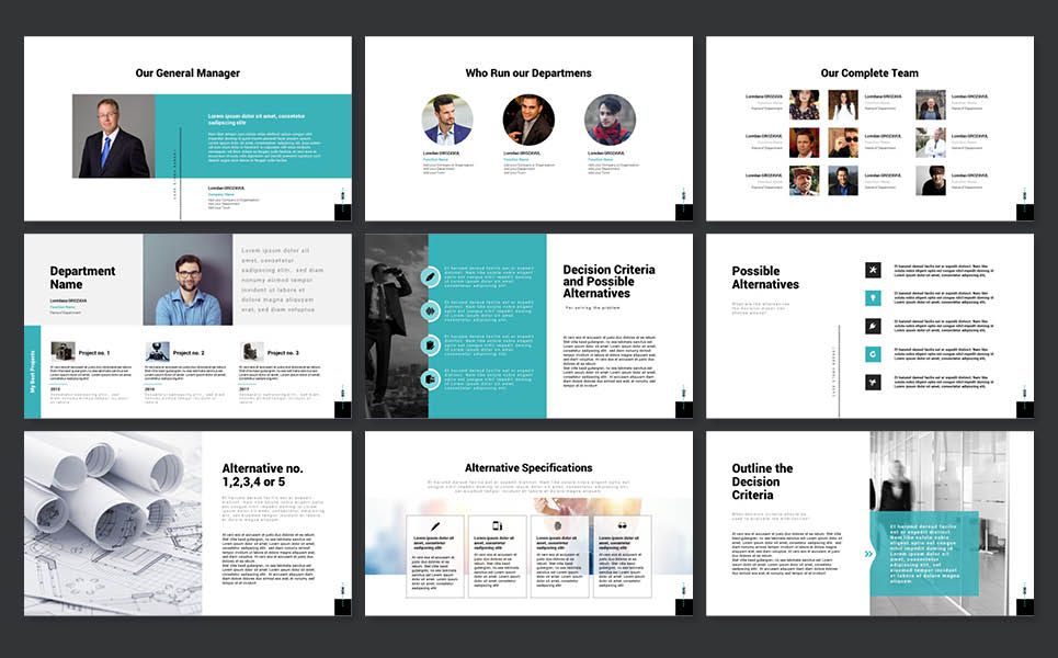
• Use layout to your advantage - direct people’s eyes certain key parts to emphasise
• No sentences - slides are visual notecards that reinforce main ideas, not complete thoughts
• Less is more - do not cram too many details and ideas onto one slide
• Keep the colours simple - stick to simple light and dark colours
• Use easy to read fonts - try to stick with one font, or choose two at the most
• Stick to large type - ensures text is readable and only important points
• Avoid over styling the text – bold type, italic, colour changes draw attention to text, but make the slide look busy and distracting
• Choose the right images – choose images that support the message and elevate it